"Nowadays, anyone can get a hold of data, put it in a business intelligence (BI) tool and create a graph"
Technological advances and ever-growing amounts of data resulted in Data Visualization becoming increasingly essential for businesses. If used well, they allow you to communicate on complex data clearly and efficiently. However, poor choices in Data Visualization lead to hard-to-read graphs or incorrect conclusions.
While presenting the correct data is the first step to making a good report, it certainly isn’t the only one. A good report tells a structured story, starting with your data and leading us through KPIs and Visuals towards the correct actions & conclusions. In the end, the goal of a report should always be to extract these meaningful stories into data-driven decision-making.
At element61, we offer this training to help you make the right data visualization decisions. It includes everything you need to know about data visualization best practices, such as:
- How to choose the right type of visualization for your data and audience
- How you can enhance your visuals by applying design principles and best practices
- How the principles of visual perception can help you understand how your data consumer's brain works
- How to tell a story with your data
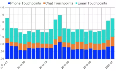
By the end of the training, you will understand that while this graph is technically correct:

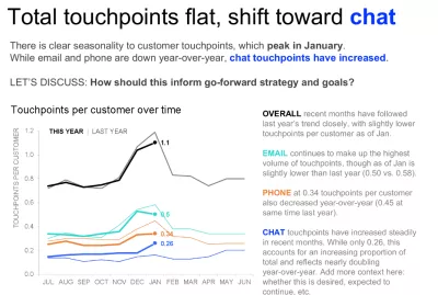
The graph below delivers much more value to your data consumers:

Training Objective
By the end of the training, you will have the skills to create meaningful and visually appealing graphs that can impact your organization. Don’t miss this opportunity to take your data visualization skills to the next level.
Audience
Anyone who works with data & data visualization. The training is technology-independent, so no matter what your preferred flavor of reporting tools is, this training will fit you.
Agenda
- Biology & Psychology behind reports
- Visual perception
- Gestalt
- Data-to-ink ratio
- Process of building good reports
- Purpose
- Structure
- Action
- Value
- The dangers of bad reports
- How (not) to lie with graphs
- Examples of applying lessons learned
- The Good, the bad & the Ugly
- Q&A
More information or registration
- For more information, contact academy@element61.be
- The training schedule can be found in the Academy Calendar (PDF)
- For a complete overview of all training, visit our Academy page