Introduction
To get a grasp on the possibilities of Power BI, you first have to struggle a little bit to appreciate its capabilities. This was also true when I started my journey with Power BI. By exploring and implementing visuals, DAX measures, ingestion methods, data modelling techniques, … I became more fluent in the language of data and data visualization. In this insight, I will provide you with my learnings over the last year and hopefully help you to get on your way quickly.
Chapter 1: Ingestion and Modelling
Let's start with the beginning of every Power BI report’s life: ingesting your data. There is an enormous pool of different data sources which you can choose from. Websites, Data Warehouses, ERP systems, Excel files,… are all possible sources for ingesting your data. The following sections will explain my findings over the last year.
Data Sources
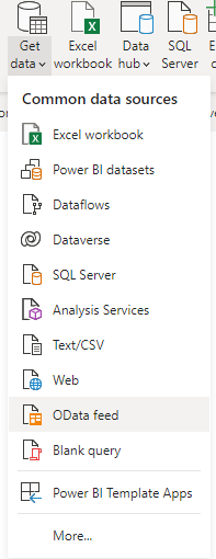
Before you ingest your data, you have to know which data sources are supported by Power BI. It is useful to see upfront if your data source is in the list of all Power BI Data Sources.
In some cases, data sources aren’t supported by Power BI. In that scenario, search for a connector provider online to be able to lay the connection. Or if you’re tech savvy you can always try to create your own custom connector via the Power Query SDK.
Data Ingestion
If you’re prepared, your data comes from a data warehouse and thus is already modelled nicely into facts and dimensions. If you want to know more about building your own Data Warehouse, element61 offers various courses on data modelling and data warehousing to set you on your way.
In other cases, your source is less prepared and requires some data modelling. This is where my journey in Power Query Editor began.
Power Query
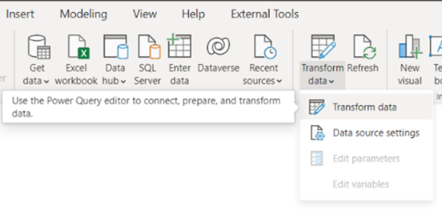
Power Query is a part of Power BI, meant to ingest and transform your data. To get started with Power Query, open a desktop file of Power BI and click on Transform Data in the ribbon. This will take you to the Power Query Editor.
When I started using Power Query Editor, I was a little bit lost and started modeling without knowing some of the best practices. To not let you fall into that trap, I will share some of my key Take Aways when using the Power Query Editor.
-
Limit your Data Ingestion
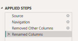
When ingesting and transforming your data, you will see all steps that Power BI takes for ingesting and modeling your data on the right-hand side of the screen. Here you will see in which order Power BI executes its commands. A first tip is to move the removal of unnecessary data (columns) as close to the ingestion step as possible. That is because Power BI uses Query Folding. This is the ability to generate a single query statement to retrieve and transform source data. When moving the removal of columns as close as possible to the ingestion step, you will achieve a faster loading time of your data, while simultaneously keeping your most important columns to focus on the task at hand.
-
Perform expensive operations last
Now that we’ve limited our initial data ingestion, a second thing is keeping your resource-expensive operations for last. Sorting columns for example requires you to read all of your data and only after that will sort it for yourself. When you do this at the beginning of your query, It will result in a slow loading time of your data. It is better to do it at the end when you’re already left with a subset of your initial data.
-
Develop with a subset of your data
If the above steps are still too slow for you when developing, put a filter on for example 'year'. This will speed up your retrieval of data and will allow you to not spend hours lingering before you see your results. In case you’re developing on a data warehouse, then you should set this filter already on the view in the data warehouse instead of doing it in Power Query Editor. This is even faster.
-
Rename your columns
Another tip is to rename your remaining columns to a more user-friendly name. In your report, CLIENT_NAME_1 for example is not a very clear name to have in your report and your end users will sometimes panic. It would be better to replace it with the Client Name.
-
Star Scheme is the way
Always keep in mind your end product: a good data model. Power BI loves a star scheme with Dimensions and Facts as a data model so try to work towards that. Transactional types of tables with lots of numeric values are modeled as Facts, mand ore describing data of those Facts are modeled as Dimensions. A full explanation of Facts and Dimensions would take us too far in this section. For more information about this topic, you can always check Microsoft's explanation on star schemes.
Chapter 2: Practicalities for the Developer
To begin developing a report, some basic knowledge and best practices will help you a long way. The following points helped me in making a clean and easy-to-work-with report.
Create a table for your measures
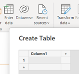
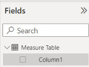
A data model can sometimes be a difficult place to navigate to find that one measure you’re looking for. By making a placeholder table that will act as a measure table, all your measures will be in one place and you’ll be able to look them up without a sweat. A measure table is essentially an empty table you created that acts as a placeholder for your measures. To do this, first click on ‘Enter data’, where you can create a new table. Next, rename your table to ‘Measure Table’. You can now start creating your measures in this table. After you add your first measure to the table, you can delete ‘Column1’. You’ll now have a central place to put your measures in.
Create folders for your measures
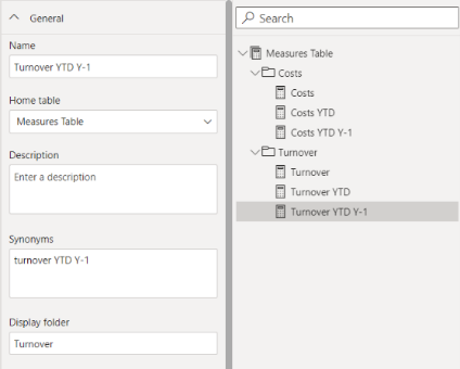
After you have created your Measure Table, you can group your measures in folders. This is a nice way to put similar measures together. An example would be a measure for turnover, but also turnover year-to-date and turnover year-to-date last year. To group your measures easily, you can go to the model view and for each measure type the display folder in which it belongs.
Organize your bookmarks
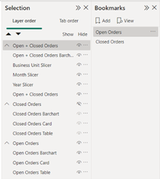
Bookmarks can be a real pain when you don’t arrange your visuals properly. Showing specific visuals per bookmark, and forgetting to hide some visuals for others,… all slow down your process. A good way to tackle this is to group your visuals in the Selection Pane. This will allow you to show or hide entire groups of visuals for your bookmarks. A simple example is a distinction between Closed and Open Orders in your report. Here you can create a bookmark for your closed orders, and another one for your open orders. Next, you can create a button to switch between the two bookmarks.
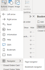
To easily create a button in your report to switch between bookmarks, you can select ‘Buttons’ in the ‘Insert Pane’ at the top, go to navigator and click Bookmark Navigator. In this button, you can now select the Bookmark option, and add the bookmarks you want to add. If you have different bookmarks across different pages, you can group your bookmarks so you only see the bookmarks of the desired page.
Use tooltips for more information
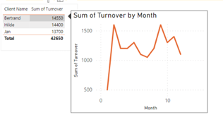
There are all sorts of different things you can do with tooltips and different situations to use them. Sometimes there is an information overload when you try to add more detailed information to your report. This can prevent you from making a lean, informative report. In these cases, I like to use tooltips to display information that is not necessary on the report page, but is handy to know if you would like some extra detail. A simple example of this is the turnover per customer. Here you can have your client and its turnover in a table but adding the turnover per month would maybe be excessive. What you could do is make a tooltip of the turnover per month that will display the customer’s turnover per month when you hover over it.
Add a date table
When you aren’t able to extract a date table from your data source, it is always a good idea to add a date table yourself, Bravo has a built-in date creator to do this. Lots of measures rely on some sort of time intelligence, like the YTD measure for example. This way, you ensure the good working of your measures you can lay your correct relations with your facts.
Chapter 3: Visualization
After successfully managing to create your data model. It’s time to visualize your carefully constructed data model. In the wild world of visualization possibilities, it’s easy to lose track of what’s important: getting value out of your data. This was also the case for me, following those tips and tricks will hopefully guide me to a fast start in visualization.
Add a background
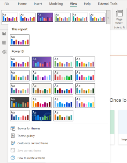
Create a personalized theme
After putting your custom background into Power BI, you can customize the theme of your Power BI report. You do this by going to the ‘view’ pane and selecting ‘Customize Current Theme’. Here you can alter the standard colors of your visuals to a color palette that best suits your report. Settings on text, visuals, pages and filter panes can also be altered here. After that, you can save your theme and import it into your next report.
Align your visuals
Talk to your end user
You can make the most beautiful visuals the world has ever seen, it would be a shame if no one’s using them. Iteration and communication are key to making a good report for your end user.
Conclusion
In conclusion, my first year in Power BI has been a journey of learning and discovery on aspects such as ingestion and modelling, best practices and visualizing data. I have learned many tips and tricks to use the tool effectively, and I have gained a deeper understanding of how to use it to solve real-world problems. Overall, my aim with this blog post was to provide a comprehensive overview of my personal experiences with Power BI and offer practical guidance to others looking to learn more about the tool.