Introduction
IBM has recently released their newest version of their core BI software, Cognos Analytics 11.1.0. We've been able to give their demo environment a first test drive and are very keen to share with you our first impressions. We will be driving you through the new features. The core new functionality in this version focuses on Artificial Intelligence (AI), as IBM has integrated their Watson AI experience into the core products of Cognos Analytics. But we've also seen many other enhancements, so without further ado, let's dive in.

Welcome
 First thing we noticed, is that they changed the logo. And that the Welcome screen other than that looks exactly like before. There is still on top the Application Bar that has a container label for all your open reporting objects, and on the right has the icon set ( Notification, Personalization, About & More). On the left you can still find the same Navigation Bar, with Home, Search, My Content, Team Content and Recent blocks on top. In the bottom there is for the Manage icon for administrators, and the New icon for authors to respectively open the Administration and Reporting tools. In the middle, a list of your Recent reports & dashboards.
Dashboard Improvements
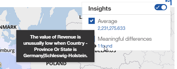
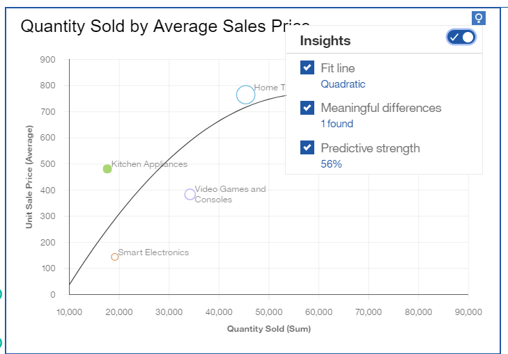
But when we open a Dashboard, we can immediately notice where the new focus of Cognos Analytics 11.1 lies. In the top right corner of every visualization a blue icon appears. One click on this Insights icon will open up a popup menu where you can select to identify certain relationships and learn insights into your data. Quite handy actually, to quickly spot and highlight the abnormalities in your data, or to automatically calculate summaries like an Average.
click to enlarge click to enlarge
![]()
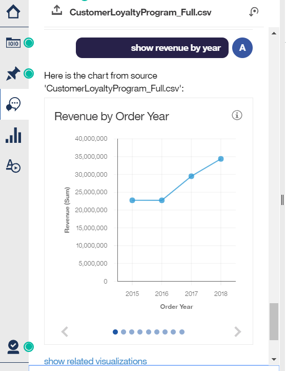
In the Navigation bar, we also discover a totally new icon that leads to the Assistant help modus. Here you can type in text like "show revenue by year" and it will automatically search for these measures, and give you a preview of several visualizations to choose from. Find what you were looking for? Then simply drag the preferred visualization into your dashboard. It feels very intuitive and definitely improves the dashboard build-up.
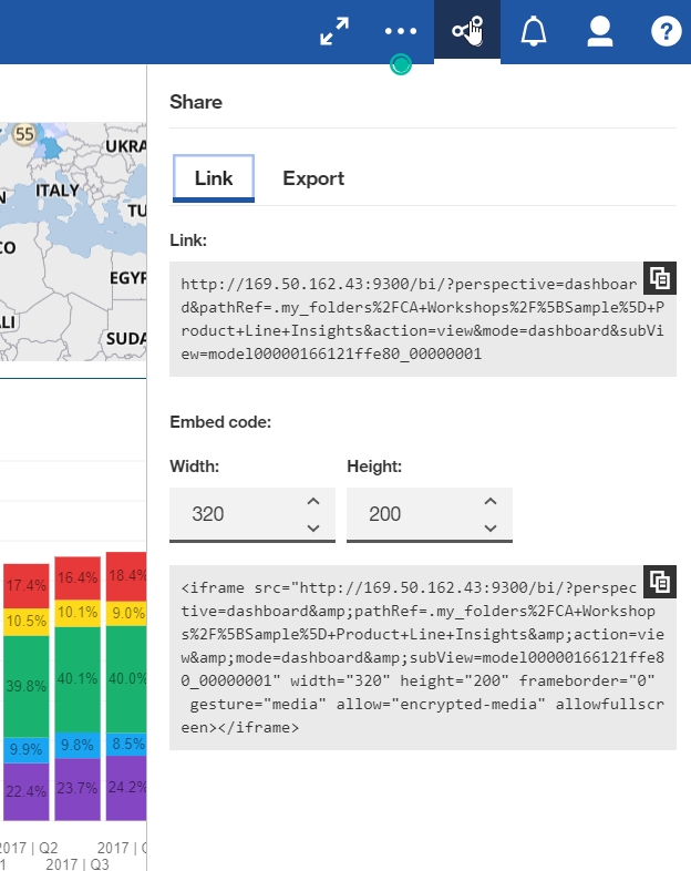
Also, sharing your dashboard or report has become much easier. Now there is a Share button in the Application bar on top. Simply press it to find the code you need to link back to this object. Especially embedding the report as an iframe in other systems has become simple and easy to use, as you can manually adapt the sizing of the iframe and then copy the adjusted link.
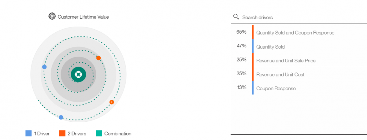
A few new visualizations (Driver Analysis, Spiral, Sunburst, Decision Tree) have been made available that render more insight into what drives your KPI's.
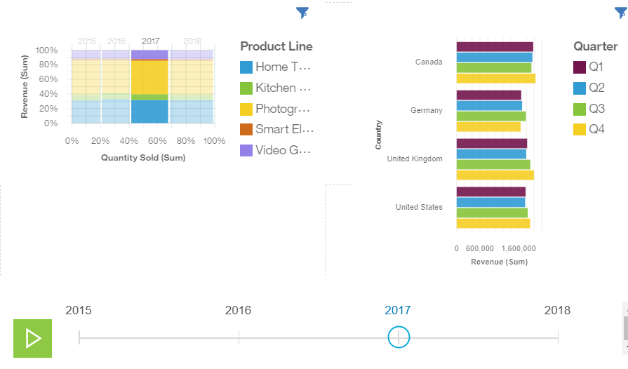
Other new visualizations include a Data Player, where you can play through a series one by one and visually see the trend impact the other graphs.
Exploration Module
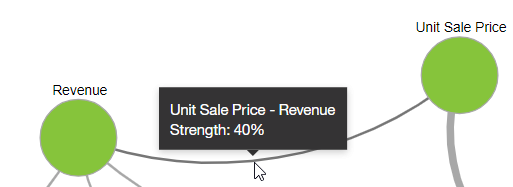
You were already able to Pin dashboards to your personal collection, to then create a new Dashboard or Story from it. New in this version is that you can also now start an Exploration. Every visualization toolbar has an Exploration button, and by clicking it you will open up a new module, that allows you to quickly identify relationships from your data measures, and how strong they are related.
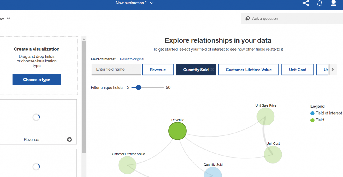
The new module then behaves like a cross-over between the Dashboarding module and the Story module, where you can show certain visualizations in a slide show order. However, the neat new feature here, is that there is an Analysis area in the right, that gives you insights on the visualization you're viewing.
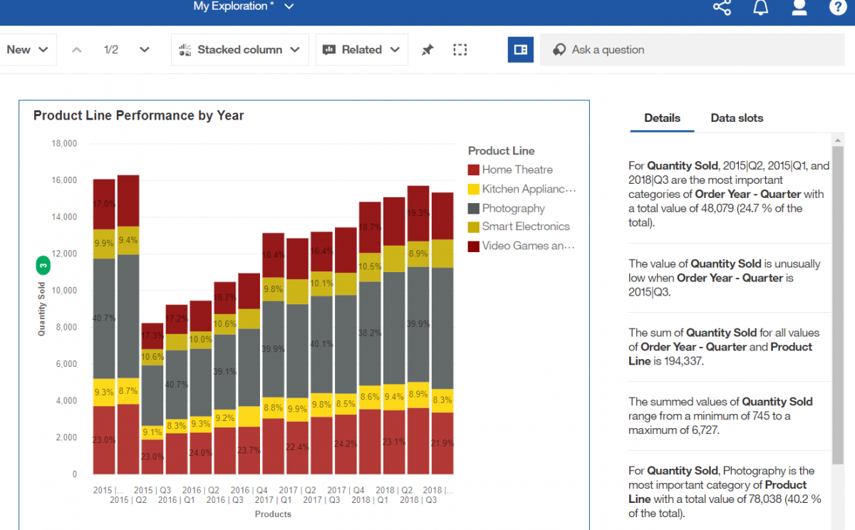
Quite neat, and definitely something we want to research more in the near future!
Styling
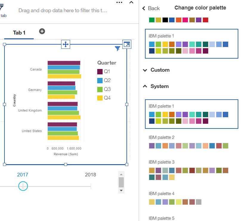
A new palette editor allows for the easy definition of a new palette for your report, and apply it quickly to all the visualizations on your report. You can also now define System Wide palettes, very easy if you want your company to adhere to certain color schemas for reporting.
If you like to enhance your dashboards with custom images, more good news: as of now the new UI allows you to manually move, resize and even rotate your image with a simple mouse click. Unfortunately they only enhanced this in the Dashboard experience. In the Reporting mode, it is not (yet?) included.
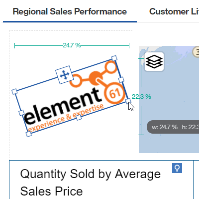
.
Visualizations
Our first impression is that all the visualizations look very slick and really pleasing to the eye. They all run nicely with small animation effects, and a wide selection of different visualizations is available. Unfortunately we still lack a real visualization editor where one can easily alter visualizations and create your own. They are defined in the JSON/RAVE format though, so experts can still edit them manually, or by using tools like the Visualization Customizer. Also a bit disappointing, is the lack of some basic setting controls in the visualizations. For example, in the above Data Player, the Play icon is fixed to the green color and box size, and doesn’t allow any Palette selection. Also, some visualizations lack a decent sizing control, causing them to show unreadable when trying to fit them into a small space of your dashboard.
Reporting Changes
If we look closer into the Reporting module, we can notice a revamped layout, with Page Preview, Settings, Properties and the Lock icons now showing just below the Application Bar. On the left, the Insertable resources have been grouped together for a more obvious page design. We believe IBM has clearly listened to their customers and partners on this, and that the new layout works even more intuitive.
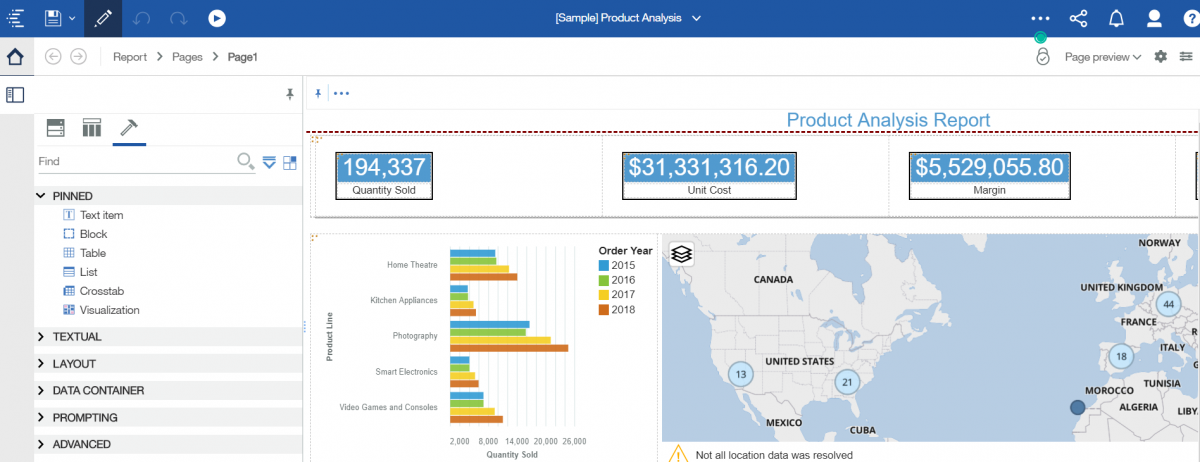
The new Settings icon in the top right corner nicely groups together the most important settings for the report. This again is a great improvement over the last version.
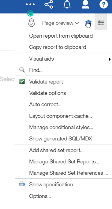
Also the Copy & Paste functionality works now like a breeze. If you for example would copy a visualization or report element into a brand new report, it will automatically also copy all the sources for you, allowing you without hassle to immediately start working on your new report or dashboard.
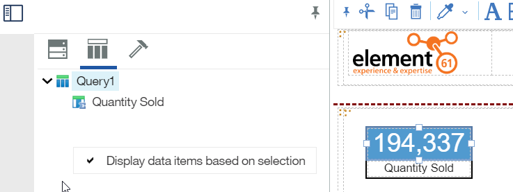
Another great new feature is the fact that you can now filter your Data Items based on selections. No longer do you need to try and locate the correct data source of a certain visualization. With just one right mouse click in the Data Items tab and you can enable or disable this handy filter.
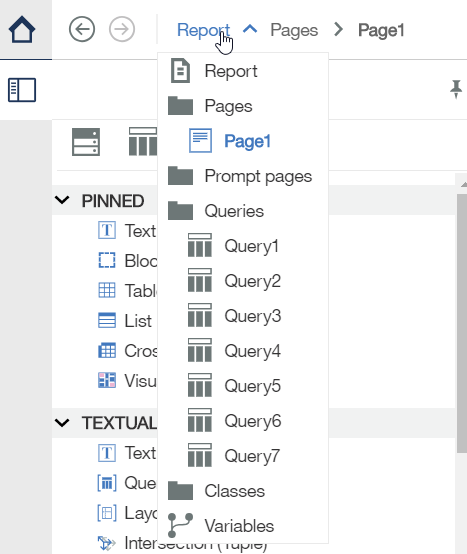
The next great change we can highlight is that browsing through your Report Pages, Queries and Variables have become much easier again. These have been moved just under the Application Bar into a neat little new Report Navigator Bar, and it also contains two brand new buttons to scroll you through your previous screens. From my first impression, these will be the life savers of your reporting team, and the best improvement in the Reporting area. For example, if you are designing your Report, and you need to quickly alter two queries, simply use the Report Navigator or press the "Back" button twice.
Content Navigator
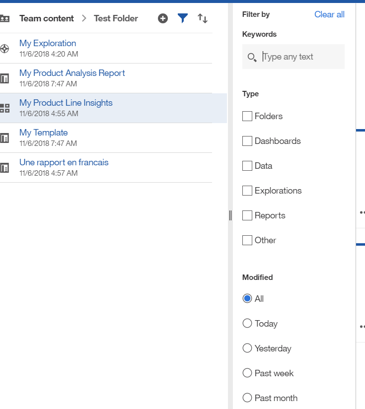
The Content Navigator now has a bit more functionality in the Filter section. You can now filter your current folder view not just on Type, but also on a Keyword search, or on a predefined Modified Date selection. This can be particularly of use on systems that contain sometimes a huge amount of reports in just one folder.
Search
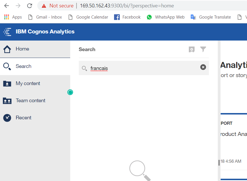
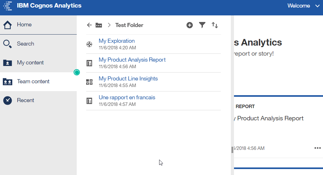
We've taken a look also at the Search area, but we have not discovered any new functionality yet there. The Search function actually still contains the same bug as was discovered in v11.0, where certain reports could suddenly disappear from the Search results, in multi-lingual environments where users would use more than one locale. (for more info we kindly refer you to the related Request for Enhancement).
click to enlarge click to enlarge
Figure: searching for "francais" returns no results, though the user can clearly browse manually to the report.
Administration
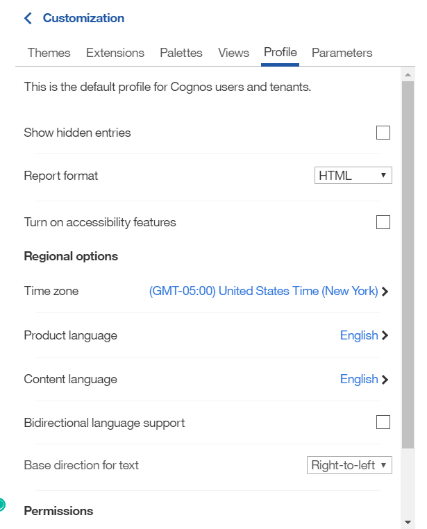
The good old classic Administration console is still there, but any new Admin functionality is being developed straight into the Manage screens. For example, the latest new Global Palettes you can define for all your reports, can be set here. Also, the Default Profile, which was unfortunately broken in v11.0.12, works again, and has now been moved here. You can easily set default settings for all your future users via this module. Those of you who were hoping on some neat new possibilities in the Theming of your site, no luck, there has not been any improvement, and the Themes are still set on version 3.0 in this edition.

Overall Impression & Conclusion
We've taken a glance at all the little aspects of Cognos Analytics, and noticed that indeed the core novelty here is the introduction of some Artificial Intelligence and help in developing dashboards, and analyzing its results. We will need to dive deeper into it, to see if it really creates an impact on reporting. But at a first glance, it does definitely looks interesting, and offers something new.
The changes in the Reporting interface have been less drastic, and more cosmetic in layout of the tool. However, they do make a big step forward in the user friendliness of the tool.
New features in Data Modules will be addressed in our upcoming Insight.
