Challenge
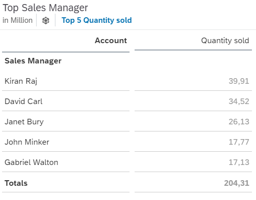
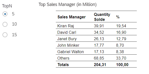
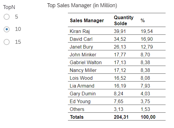
SAC table widget offers the possibility to show top N (e.g. top 10) based on key figure value (e.g. Quantity sold). After applying this option, N (e.g. 10) members of selected dimension will be listed. However, if there is the requirement that the remaining members which are excluded from the top N table, should be summed up to one row below the top N members, we could not produce this view with standard SAC table.
Solution
With the embedded of R visualization in SAC, we could leverage the R Scripting to satisfy this demand easily. Within this insight, we use the case study of Best Run to show top N Sales Managers in terms of Quantity Sold. We will also explain the step to integrate the input control to select different value of Top members (eg. Top 5, Top 10, Top 15) via Input Paramters and the scripts to get the percentage column next to the keyfigure column (Quantity sold in this case). One of the interesting possibilities of using R within SAC story is that it’s not a standalone widget but it could be interacted with Story filter or Input control of the page. As so, the R widget is not disconnected to the analysis report environment.
SAC Story and R Visualization
Create a story based on the Best Run model and put a R Visualisation in the canvas. We could add input control e.g Location, Product if desired.
R packages which are necessary to form the visualization as required are: dplyr, flextable and officer.
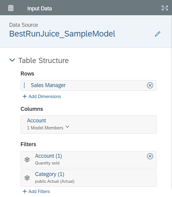
For the input data, select the model and choose Sales Manager in rows, Account: Quantity Sold in Column.
For Input Parameters
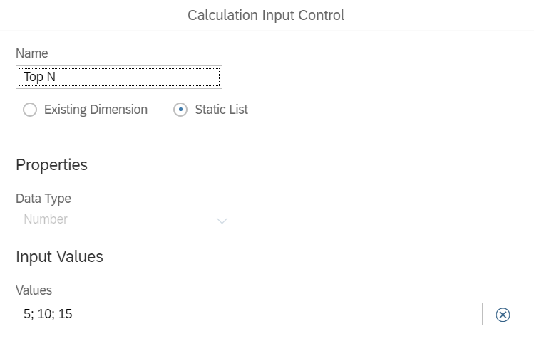
Create Static List of value 5; 10; 15 and give name “TopN”.
This input control could be used as a variable in R script later.
Add the script to the R visualisation by opening the script window and add the following script (shown below)
Code and explanation
Create data frame from Model input including Sales Manager and Quantity Sold
Sort Quantity Sold and get the Top members based on TopN parameter. If the number of Sales Manager is more than parameter value, the data frame will include the line Others as the sum of the remaining. “Totals” row also be added.
This line calculates percentage by dividing Quantity Sold to Total Quantity Sold.
This part of code aims at formatting decimal place and to use “,” for decimal.
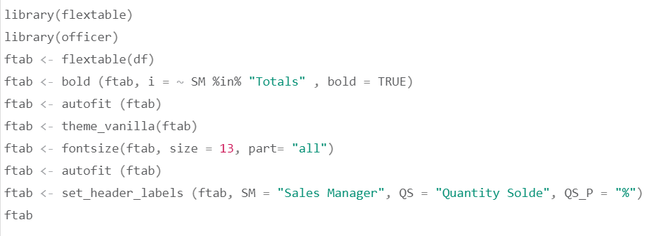
Finally, we could display the data as a table by using package flextable.
Result
SAP Analytics Cloud version used in this article:
System Name 6EA70
Version 2021.1.1
Build Date Wed Dec 09 2020 19:27:14+0100
Keen to know more
Continue reading or contact us to get started:
