Introduction
If you’ve been working with Power BI semantic models for a while, you may have noticed that things can get very cluttered over time. Especially when you need to compare a set of measures from a time-perspective (current, year-to-date, previous year), or compare results in different currencies.
This is where calculation groups come into play, to drastically simplify your model while keeping the same functionality and performance. Until recently, these could only be created in Tabular Editor, but now you can do this directly in Power BI!
In this Insight, you’ll find out how to:
- Create calculation groups
- Use them as columns
- Use them as slicers
- Combine multiple calculation groups
All within Power BI Desktop leveraging the new preview feature (Public review Nov 2023)
What are calculation groups
Calculation groups are a feature in DAX that allows you to create a set of reusable calculations, which can be applied on top of any other measure. A common scenario would be the requirement to compare a set of measures over several periods, without having to duplicate parts of code.
In financial reporting, you would find measures like Sales, Expenditure, and Profit.
Business users often want to compare these figures to the previous year, quarter, or month, see the total for the year-to-date, quarter-to-date, or compare those figures again with last year’s figures. The model could potentially have Sales YTD, Sales QTD, and Sales PY, … the sky is the limit here, but there are about 9-period types to compare to. Following this, the model could require 3x9 measures and complex methods for setting up the visuals with the dynamic to pick certain measures to compare.
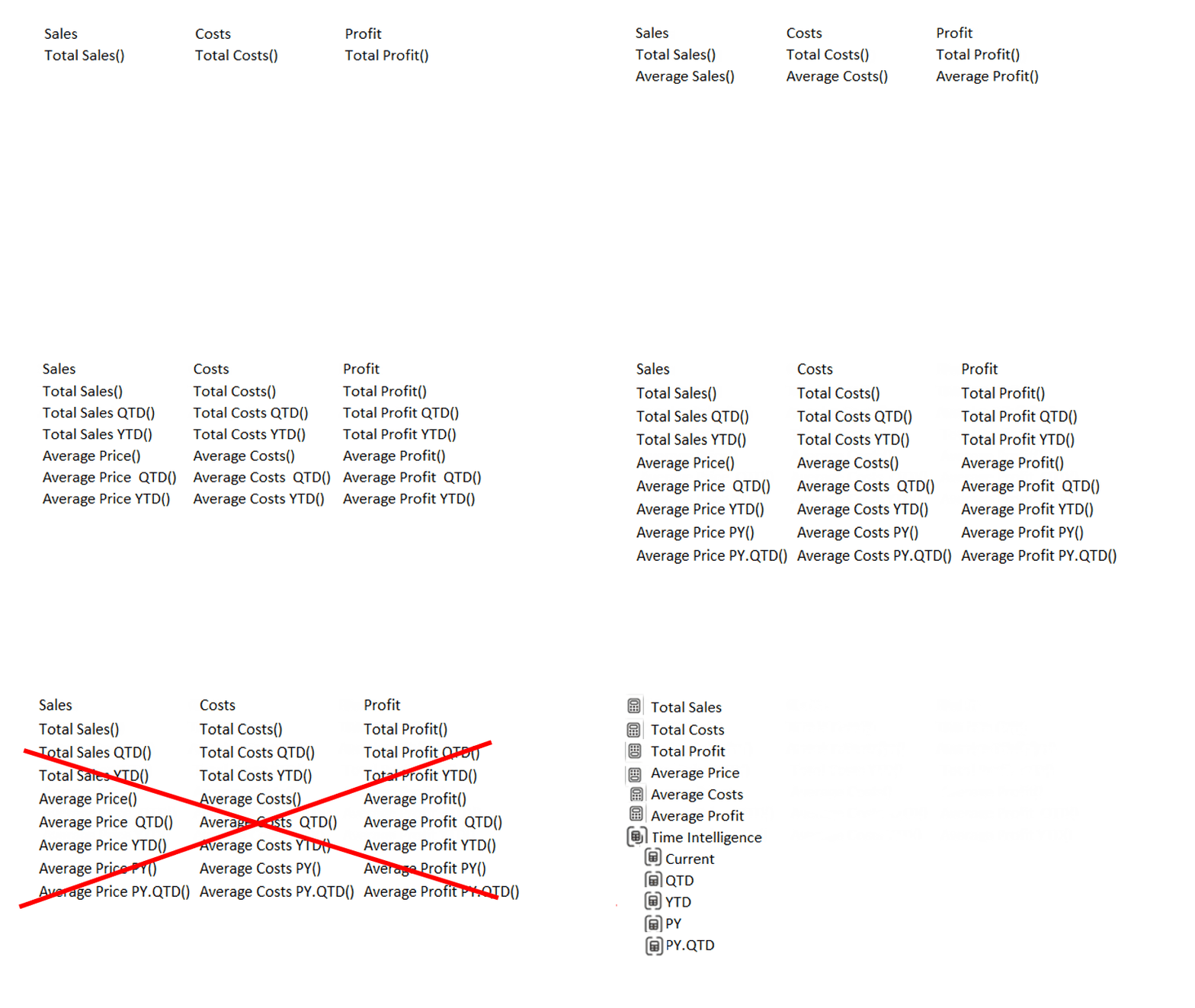
With Calculation groups, only 1 extra measure needs to be set up and it can do the math for each measure as you’ll see further down this insight.
When you add a calculation group to your report page, it acts as an extra layer on any measure you have in there, and so It simplifies the model and set up of visuals profoundly for the report creator.
Some things to keep in mind
- To use this feature, the model needs to be either an Import or Composite model. So if you were using a live connection on Azure Analysis services, you’d need to add a layer on top by creating a composite model. This can give some overhead and is not always possible, depending on your internal policies. If you use a composite model, the calculation group should be in the "local" part, while your measures should be in the "remote part" for things to work as expected.
- When you activate this feature, automatic measures will be disabled, which means you won’t be able to drag columns into visuals anymore as “implicit measures” (where they are automatically aggregated). Any implicit measures will remain, so: a column brought in a visual and aggregation set within the visual will not be undone. So from now on you'll be creating each measure explicitly, which is best practice anyway and not so much work, if you think about it.
- When this insight was written, the feature was still in preview so if you don't see the "Calculation group" in the Model view of your report

you will need to go to enable the setting via File\"options and settings"\Options\preview features and check
Let’s get to work for Contoso, our favorite customer
The starting point: look at this mess!
A report for Contoso shows: Sales, Quantity Sold, Average Unit Costs, and Average Unit Price. To show the figures on a YTD and QTD time scale, we already created 8 extra measures

The moment the Business requirement comes in that also previous year needs to be shown with matching averages and totals, it becomes clear that not only we would need to make too many visuals, but also extra measures and formats... Time to create a Calculation Group!
Setting up a Calculation Group for Time Intelligence
Before the feature was released, you needed to open your model in Tabular Editor, which is a great tool, but not every company allows the extra installation. But now, you can create and edit calculation groups from the model view of the Power BI desktop, where you’ll find the option to create a Calculation Group, either from the ribbon or also in the Data tab under Model:
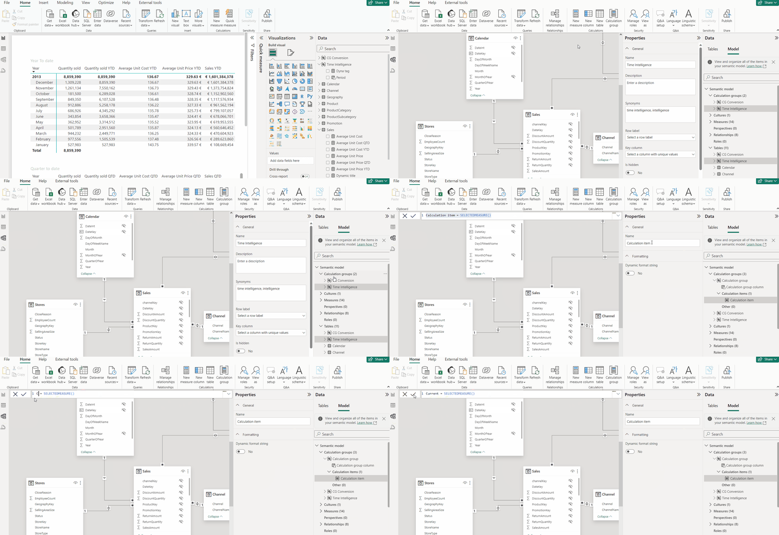
Once you've created the calculation group with a default “Calculation group Column”, you’ll find the focus already on the first “calculation Item”:
In this context, you can replace the code with “Current = SELECTEDMEASURE()” which will give the following in the Data Model tab.

After this, you can rename the calculation group like “Time Intelligence” and the column to “Period”, making the use of them more intuitive. Then, you can add more items to the calculation group, either in the list or with a right-click.

After a bit of editing, the result can be like this list of calculation items, which can be reordered as you like, of course:
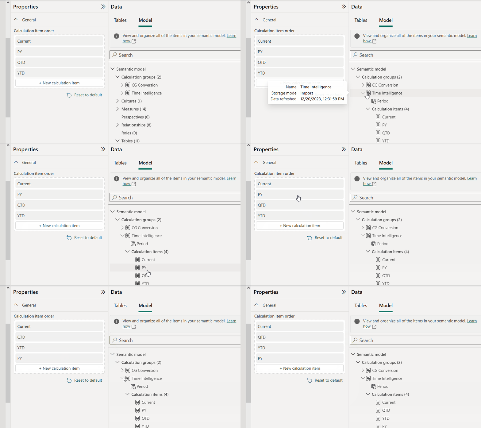
The code will be like:
DAX

Current = SELECTEDMEASURE()

QTD = TOTALQTD( SELECTEDMEASURE(),'Calendar'[DateKey])

YTD = TOTALYTD(SELECTEDMEASURE(),'Calendar'[DateKey])

PY = CALCULATE( SELECTEDMEASURE(),PREVIOUSYEAR('Calendar'[DateKey]))
Now let's put this calculation group into play
A simple way of using the Calculation group is to put it in a matrix as a column as shown below. By adding the slicer on Period( see to the left of the matrix) the columns can be shown or hidden as wanted.
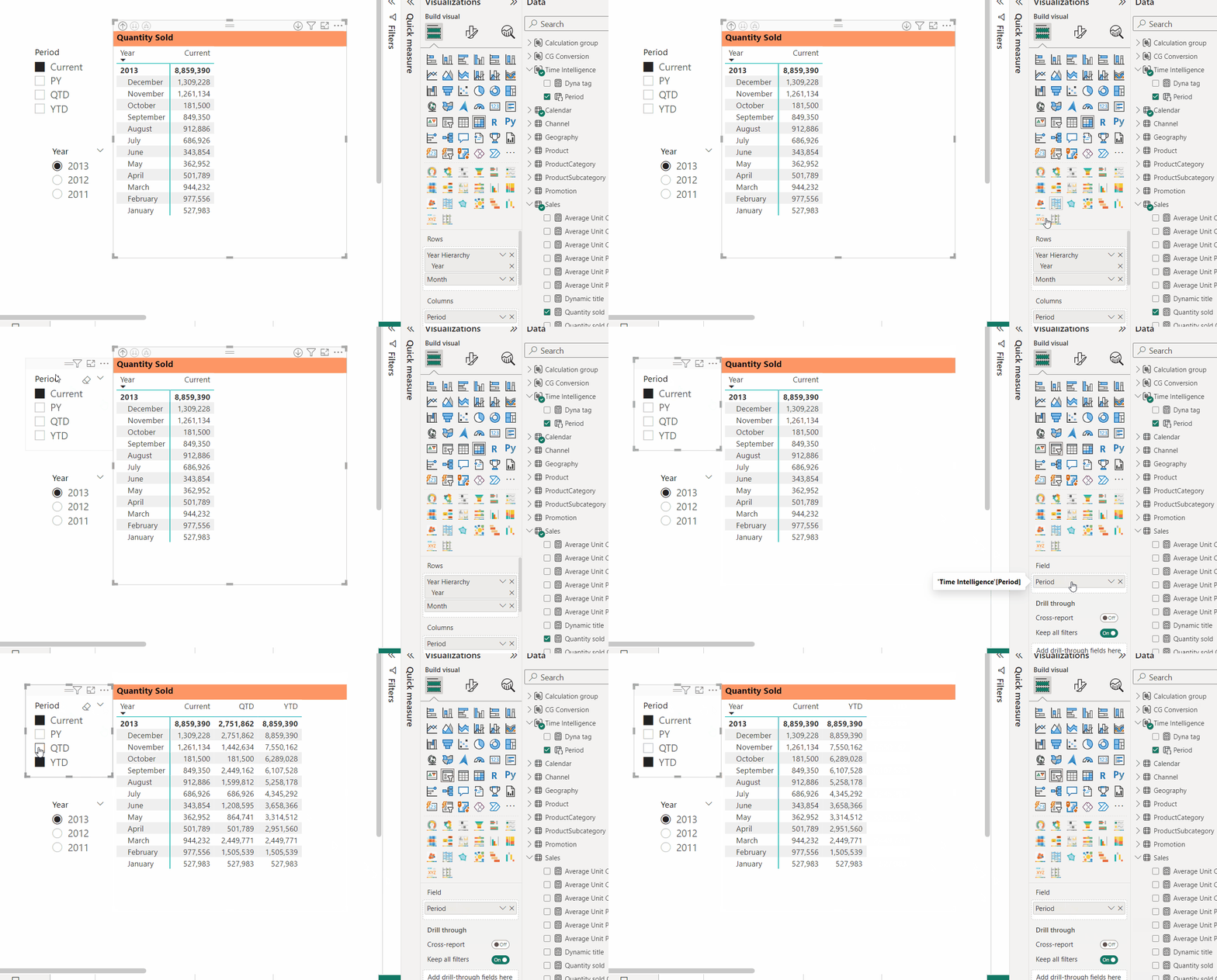
Using the Calculation group as a slicer
The below example shows how the central matrix contains the simple measures as columns. But the slicer “Period” on the bottom left converts the result of each measure, according to the selected period.
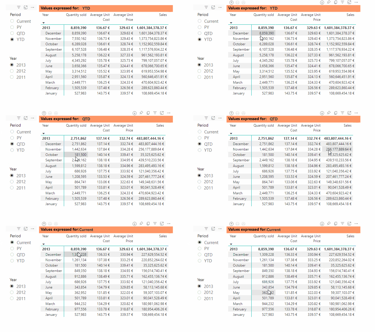
Notice as the slicer is set to select the QTD setting, both the columns Sales and Quantity get reset every quarter, which shows the “monthly” result for Jan, Apr, Jul & Oct. The averages are calculated according to the QTD logic as expected.
Multiple Calculation Groups
Now another complication comes in a senior member of the management, who has still not digested the unification to the Euro, wants to be able to see value expressed in Belgian Francs, while others need to see results in US dollars ($).
For this, you simply make a new calculation group, called Currency, following the steps as above for the Time Intelligence.
When used as a slicer in the previous example, but now showing 4 basic measures instead of only Quantity Sold,
you would have a variation like this where you can apply both Time Intelligence and change the currency, without adding all the combinations of these, like YTD in €, QTD in BEF, and Current in $:
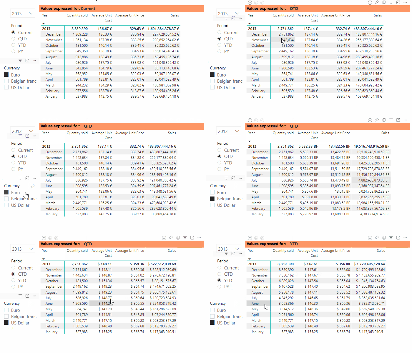
Power BI applies the calculation groups one after the other, according to the Precedence of each Calculation group. In our example, each base measure is first transformed by the Time Intelligence and then converted to the chosen Currency. With The precedence, you can instruct Power BI to apply the transformations. Note that in our example, we have now avoided making 48 measures ( 4(periods) x 3(currencies) x 4(base measures) ) but kept it simple with 2 calculation groups and 4 base measures.
There are 2 things which can be observed here:
- The format of the values Cost, Price & Sales is changed together with the chosen Currency.
- The column Quantity Sold is not affected at all by the selection of Currency.
and we'll explain those behaviors below.
Applying Format and adding exceptions
Within each calculation item, a logic can be added to exclude certain measures from being impacted, for instance, by the measure group. For this, there is a specific function that can be used in the DAX formula: ISSELECTEDMEASURE(), which returns a Boolean.
In our example of the Conversion group, this is applied as follows:
Belgian franc =

SELECTEDMEASURE() *

IF(NOT ISSELECTEDMEASURE([Quantity sold])

,40.3399,1)
So, this explains how the Quantity Sold is not altered.
For the Dollar conversion, this measure would of course reference a conversion table, but this particular one was set in stone when the Euro was consolidated so it was hardcoded as 40.3399.
Each Calculation Item can have a dynamic format, which allowed us to put either $ 123.00 or 5,000.00 BEF in the table. The dynamic format is similar to what was already available for simple measures.

Here as well, an exception was included in the code, preventing the value of Quantity Sold from being shown as if it were money, but keeping the original format by using the expression SELECTEDMEASUREFORMATSTRING()

Conclusion
Using Calculation groups is a powerful way to simplify your models, making life so much easier for the report builder. At the same time, you allow lots of dynamism and flexibility to show what an ever more demanding audience may require. Furthermore, it allows the business users to do some data analysis themselves.
Until recently, you could only access this extension via Tabular Editor, which not every company allows. But now, you can finally edit these DAX elements from within the Power BI desktop with ease.
Want to know more
Find more information in Microsoft Learn:
- Create calculation groups
- Information functions: ISSELECTEDMEASURE
- Information functions: SELECTEDMEASUREFORMATSTRING
To use this feature in a Composite model. There are some rules to respect. A measure using both local and remote tables /measures can only work with calculation groups if the measure is calculated on the remote part. Seem unclear or want to know more? Check out Understanding the interactions between composite models and calculation groups.


