Power BI Premium provides dedicated resources to run Power BI in an organization. It can be a great cost saver to try and use this dedicated capacity as efficiently as possible without paying for unneeded resources. This is where performance tracing can help us analyze system usage and help make informed decisions about scaling up or down.
Keep in mind that scaling up is not always the correct step to take. Performance tracing can also help you find sub optimal model designs. In this case redesigning the model would save you resources and make it unnecessary to scale up. Thus, saving you money.
While Optimization of a single model is out of scope for this insight, Performance tracing can and should be used to look for models that might need some optimization.
Power BI Premium Capacity Metrics
The Capacity Metrics Power BI app gives many different insights on the usage of your capacity’s performance. It also gives a more detailed view than the Admin portal Health tab. The app can be easily installed using the following link: Power BI Premium Capacity Metrics. Once the app is installed, a dataset, a report and a dashboard will be created with the name “Power BI Premium Capacity Metrics” inside an app with the same name.
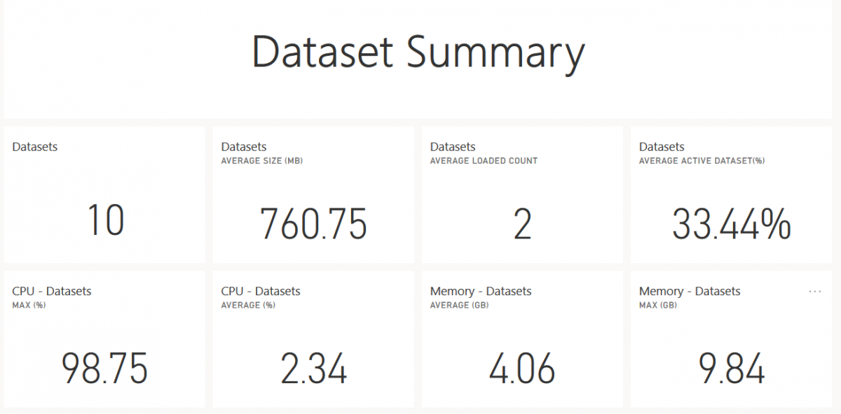
The Dashboard gives a global overview in numbers, no graphs, and is a little cluttered so I advise sticking to the report.
The report itself contains a lot of information. There are six different pages going from a global overview on “Resource Consumption” to more specific details in “Datasets”. Some pages even contain buttons that switch visuals, based on your preferred topic.
Here is a short overview of the six pages and their function
- Datasets: Metrics about datasets. Information about refreshes, queries and possible bottlenecks.
- Paginated Reports: Usage and runtime of paginated reports
- Dataflows: Amount, duration and resource consumption of data refreshes
- AI: Usage and resource consumption of AI components
- Resource Consumption: Global overview of CPU and memory consumption
- IDs and Info: Meta data about Capacities, Workspaces, Datasets, Paginated Reports and Dataflows
All the pages (except for IDs and Info) have filters on date and Capacity.
For monitoring, it’s always interesting to start at the highest level and get a good overview of the system. Especially if there was a noticeable drop in performance.
Resource Consumption tab
Resource Consumption is the best place to start looking for the cause. On this tab we can easily find whether the issue is memory related or CPU related and which of the Power BI components is causing it. The tab is split into two visuals. One for CPU and one for Memory consumption. Both show data for the previous seven days and are split into five categories. One global usage category and four for each of the different resource consumers. CPU consumption shows hourly consumption as a percentage. Memory consumption shows hourly GB consumption as well as the limit for each workload (dotted lines). This can quickly give an indication if a workload limit is too constraining. These two graphs should make it very clear when resources are being used close to or at their maximum limit and which of the workloads is causing it. Next, we can move to the page of the workload in question to further investigate performance issues.
Datasets
Let’s dive into one workload specifically: Datasets. Analyzing other workloads will have a lot in common with this one, so I will not break them all down specifically. The Datasets page has an extra filter on dataset. Multiple datasets can be chosen using CTRL-Click. There are four extra buttons which will show different visuals for the following subjects: Refreshes, Datasets, Query Durations and Query Waits.
Visual: Refreshes - Overview
This first visual gives an overview of the following data for all datasets:
- Their Total Count of refreshes
- Reliability as a percentage of refreshes that succeeded
- Maximum and average time of Wait time (time between scheduled start and actual start)
- Duration.
Keep in mind that all this information is only of the past seven days.
Visual: Refreshes - Hourly Refresh Count and Memory Consumption (GB)
Next is the visual in the middle of the page. It compares refreshes to Memory consumption. A failed refresh, colored black, accompanied with a 100% use of memory is a sign that not enough memory is available or that the query should be optimized.
Visual: Refreshes - Hourly Average Refresh Wait Times (minutes)
This visual can help with further assessment. Multiple spikes with high refresh wait times is a good indication for a capacity that is overused. Moving datasets to other capacities, playing with schedules and upgrading a capacity are all valid options to consider.
Visual: Datasets
The next button shows information about the Datasets themselves.
Dataset Sizes shows the maximum size a dataset reached.
Dataset Eviction Counts shows the amount of evictions per dataset. When memory is almost at full use, other datasets will be evicted from memory. The dataset that is least recently used gets evicted first. Loading an evicted dataset adds time to the query because the dataset must first be loaded into memory. It is advised to avoid evictions for frequently used datasets.
Dataset count and evictions VS memory usage.
Are there many datasets being used with equal memory usage or is one dataset filling all memory? Are two datasets constantly evicting each other? These are questions we can keep in mind while looking at these visuals.
Visual: Query Duration
Query Durations gives more information about the number of queries and their duration. A lot of long queries can be a sign that the underlying model is not optimized. It may also indicate that the capacity isn’t enough for the number of users using the model.
Visual: Query Waits
Lastly, Query Waits shows the number of queries that had to wait on system resources before starting execution. The type of wait will tell us what kind of resource the bottleneck is. Other pages have similar visuals and information as summarized above, but regarding to their subject.
Usage of reports
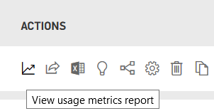
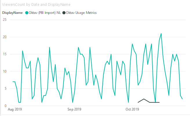
Another important resource when looking at resources usage is the Usage Metrics. It can be very informative to see how many users use a report or dataset to make informed decisions based on the information you get out of the Capacity Metrics app. Maybe some refreshes can be avoided because a dataset is unused? This can be done by navigating to a report and clicking “View usage metrics report”. A report will be generated that shows the amount of views and users per day. If you save a copy of the report and remove the filter on the report it was generated for, a global view of usage per report can be visualized.
Remove this filter for a global overview
Optimization and problem solving
The Capacity Metrics Power BI app will make finding the cause of capacity pressure a lot easier. Every problem usually has multiple ways to be solved. It’s a matter of evaluating different options and choosing the best fitted one for your organization.
Here are some examples:
A high total active memory and a low amount of evictions. Memory is high because a lot of models are being used or one model is very large. Also, none of them get evicted because they are actively being used. To solve the memory pressure issue, you can decrease the model size, decrease the number of models on the capacity node, convert to direct query (no dataset needs to be imported) or increase the memory limit. All are valid solutions, and which one you decide to use will depend on your personal situation.
High query wait times/ High CPU usage/ A lot of concurrent connections. High query wait times can be caused by the CPU being too busy handling all incoming queries. This can be expected if a lot of users are simultaneously active or each report page has too many visuals. It is best to limit the number of visuals and not go overboard. Every visual, no matter how small, will send its own queries to the database. An increase of users can be a sign to upgrade the capacity.
Though this is certainly a high-level look into Performance Tracing for Power BI Premium, it should get you started. For a deeper understanding, please get in touch and contact us.


